Desktop
Tablet
Mobile
Section Details:
Core Features:
" width="20px"><path d="M 0 3.636 C 0 1.628 1.628 0 3.636 0 L 16.364 0 C 18.372 0 20 1.628 20 3.636 L 20 16.364 C 20 18.372 18.372 20 16.364 20 L 3.636 20 C 1.628 20 0 18.372 0 16.364 Z" fill="rgb(0, 0, 0)" height="20px" id="IZSi1coWj" width="20px"/><path d="M 0 1.091 C 0 0.488 0.488 0 1.091 0 L 8.727 0 C 9.33 0 9.818 0.488 9.818 1.091 C 9.818 1.693 9.33 2.182 8.727 2.182 L 6 2.182 L 6 8.727 C 6 9.33 5.512 9.818 4.909 9.818 C 4.307 9.818 3.818 9.33 3.818 8.727 L 3.818 2.182 L 1.091 2.182 C 0.488 2.182 0 1.693 0 1.091 Z" fill="rgb(255, 255, 255)" height="9.818181818181817px" id="zORJGudlH" transform="translate(5.091 5.091)" width="9.818181818181817px"/></g></svg>)
Arc
Components:
" height="19.96558277833454px" id="IRXqvS7EE" transform="translate(2 2.033)" width="20.000000216391754px"/></svg>)
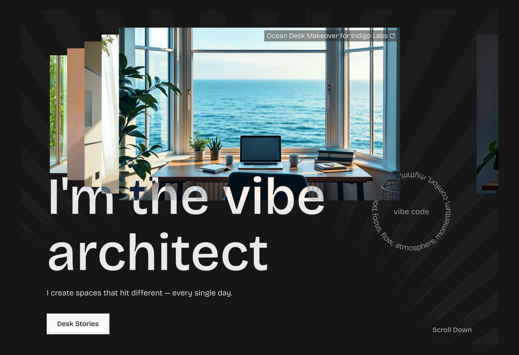
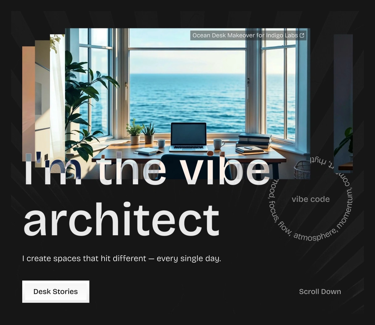
Hero Image Card 01
Stacked Images 01
Arc 01
Variables:
Hero Heading
Hero Subheading
Case Study Image 1
Case Study Title 1
" width="20px"><path d="M 0 3.636 C 0 1.628 1.628 0 3.636 0 L 16.364 0 C 18.372 0 20 1.628 20 3.636 L 20 16.364 C 20 18.372 18.372 20 16.364 20 L 3.636 20 C 1.628 20 0 18.372 0 16.364 Z" fill="rgb(0, 0, 0)" height="20px" id="Im0dvCGKy" width="20px"/><path d="M 5.455 0 L 9.818 0 C 12.831 0 15.273 2.442 15.273 5.455 C 15.273 8.467 12.831 10.909 9.818 10.909 L 5.455 10.909 C 2.442 10.909 0 8.467 0 5.455 C 0 2.442 2.442 0 5.455 0 Z M 1.636 5.455 C 1.636 7.563 3.346 9.273 5.455 9.273 C 7.563 9.273 9.273 7.563 9.273 5.455 C 9.273 3.346 7.563 1.636 5.455 1.636 C 3.346 1.636 1.636 3.346 1.636 5.455 Z" fill="rgb(255, 255, 255)" height="10.909090936183928px" id="ubu6B0L0p" transform="translate(2.364 4.545)" width="15.272727280855175px"/></g></svg>)
Show Case Study Title 1
" width="20px"><path d="M 0 3.636 C 0 1.628 1.628 0 3.636 0 L 16.364 0 C 18.372 0 20 1.628 20 3.636 L 20 16.364 C 20 18.372 18.372 20 16.364 20 L 3.636 20 C 1.628 20 0 18.372 0 16.364 Z" fill="rgb(0, 0, 0)" height="20px" id="ed3x511C4" width="20px"/><path d="M 7.086 5.771 C 6.885 5.462 6.541 5.275 6.172 5.275 C 5.803 5.275 5.459 5.462 5.258 5.771 L 0.176 13.588 C -0.042 13.923 -0.059 14.351 0.132 14.703 C 0.323 15.055 0.691 15.274 1.092 15.273 L 11.252 15.273 C 11.652 15.274 12.021 15.055 12.212 14.703 C 12.403 14.351 12.386 13.923 12.168 13.588 Z M 12.717 0.001 C 13.508 -0.017 14.247 0.394 14.648 1.076 C 15.049 1.758 15.049 2.604 14.648 3.286 C 14.248 3.969 13.509 4.381 12.718 4.363 C 11.533 4.337 10.585 3.368 10.585 2.182 C 10.585 0.996 11.532 0.027 12.717 0.001 Z" fill="rgb(255, 255, 255)" height="15.273287207114528px" id="SRXjv3eCI" transform="translate(2.909 2.364)" width="14.948488583764094px"/></g></svg>)
Case Study Image 1
" width="20px"><path d="M 0 3.636 C 0 1.628 1.628 0 3.636 0 L 16.364 0 C 18.372 0 20 1.628 20 3.636 L 20 16.364 C 20 18.372 18.372 20 16.364 20 L 3.636 20 C 1.628 20 0 18.372 0 16.364 Z" fill="rgb(0, 0, 0)" height="20px" id="SvZYH4UZd" width="20px"/><path d="M 1.129 4.402 L 1.129 4.402 C -0.376 5.909 -0.376 8.35 1.129 9.857 L 1.129 9.857 C 2.636 11.362 5.077 11.362 6.584 9.857 L 6.584 9.857 M 9.857 6.584 L 9.857 6.584 C 11.362 5.077 11.362 2.636 9.857 1.129 L 9.857 1.129 C 8.35 -0.376 5.909 -0.376 4.402 1.129 L 4.402 1.129 M 4.402 6.584 L 6.584 4.402" fill="transparent" height="10.985746523688663px" id="dg4rjh4O_" stroke-dasharray="" stroke-linecap="round" stroke-linejoin="round" stroke-width="2.18" stroke="rgb(255, 255, 255)" transform="translate(4.545 4.545)" width="10.985746523688631px"/></g></svg>)
Case Study Link 1
Note:
You’ll see as many sets of variables as the number of Hero Image you choose to include.
Code:
Negative Margin
Effects:
" width="20px"><path d="M 4.372 8.198 C 6.303 7.812 7.812 6.303 8.198 4.372 L 8.891 0.909 C 9.133 -0.303 10.867 -0.303 11.109 0.909 L 11.802 4.372 C 12.188 6.303 13.697 7.812 15.628 8.198 L 19.091 8.891 C 20.303 9.133 20.303 10.867 19.091 11.109 L 15.628 11.802 C 13.697 12.188 12.188 13.697 11.802 15.628 L 11.109 19.091 C 10.867 20.303 9.133 20.303 8.891 19.091 L 8.198 15.628 C 7.812 13.697 6.303 12.188 4.372 11.802 L 0.909 11.109 C -0.303 10.867 -0.303 9.133 0.909 8.891 Z" fill="rgb(0, 0, 0)" height="20px" id="TD1Mkd6rR" width="20px"/></g></svg>)
Appear
Text
How to use:
Click the Copy button on any Section card or preview page.
Paste it anywhere in your Framer project where you need the layout.
Adjust Text, Images, and Variants using built-in Variables.
Unlink the section for full control and deeper customization.