Beginner / Non-Designer Friendly Framer Starter Template
Remix it, Explore it, Learn from it — it's your shortcut to a great start in Framer.
Remixes

You don't have to be a designer to make something beautiful. This beginner-friendly Framer Starter Template gives you a clean starting point — with balanced spacing, clear Typography, and ready-to-use Components. Focus on your idea, not the alignment.
What's Inside
When you open a blank Framer canvas, it can feel exciting — or overwhelming.
This Starter Template keeps the excitement and removes the uncertainty.
It's made to help beginners skip the "Where do I even start?" phase.
Every element is structured with the same care a designer would give a real client project — so you pick up good habits just by using it.
From Typography to Layout Padding, everything works together right out of the box.
Here's what's inside:
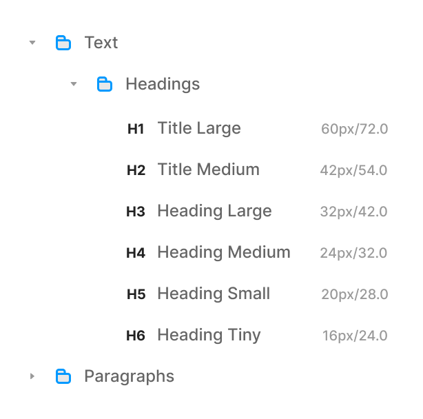
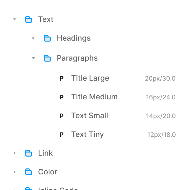
Fonts:
You don't have to stress about what Font Size to use or how to organize Text Styles in your project.
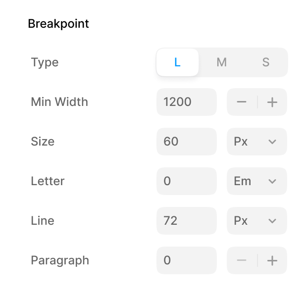
The Starter Template already includes a complete Typography system — Headings, Paragraphs, and small text — ready for every Breakpoint.
Just change the Font Family to your own brand Font, and you're done.
No resizing, no adjusting Line Heights (unless your project really needs it).
Everything already scales smoothly across Desktop, Tablet, and Mobile.
Think of this as a clean foundation — designed to look good no matter what Font you choose.
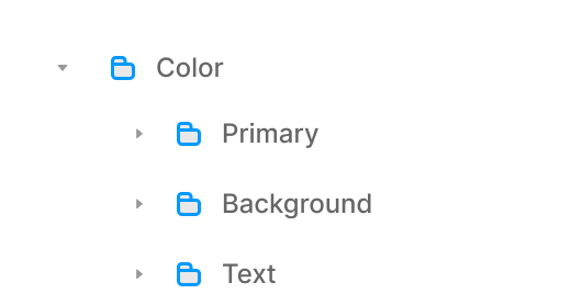
Colors:
Here's the easiest part — Color setup.
You'll find a set of Color Styles for Backgrounds, Text, Borders, and Accents.
You can use them as suggested below, but they're not rules — feel free to explore, experiment, and adapt them to your own style.
Primary: for Actions and Highlights
Secondary: for Accents or Alerts
Text and Background: for Contrast and Readability
Border / Surface / Hover: for Subtle Structure and Depth
Change just one — your Primary Color and you'll instantly see the entire Starter Template adapt. Buttons, Links, and Highlights all update together.
The goal isn't to lock you into a palette — it's to give you a system that reacts the way it should. You focus on the mood; the logic's already there.


Templates:
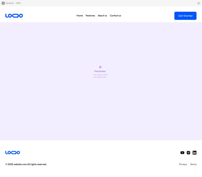
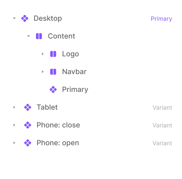
Every layout starts with structure — and this Starter Template gives you that right away.
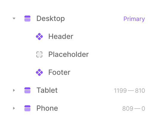
It includes a Main Container and Section Containers with built-in Padding, Gaps, and Alignment for each Breakpoint — Desktop, Tablet, and Mobile.
You don't need to wonder "how much Padding feels right?" or adjust stack directions manually — it's all done.
Everything from Padding to Gaps scales smoothly across screen sizes, so your Layout always keeps its rhythm.
Just drop in your content, duplicate a section, and everything stays aligned, balanced, and responsive — no guesswork needed.
Think of this as the canvas setup part of Framer — ready to build, never blank or confusing.
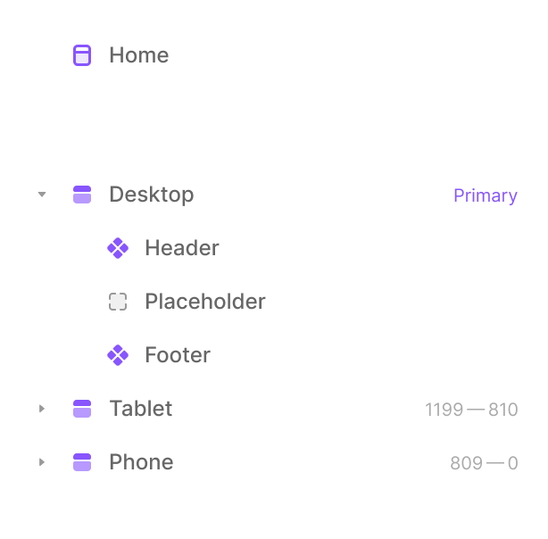
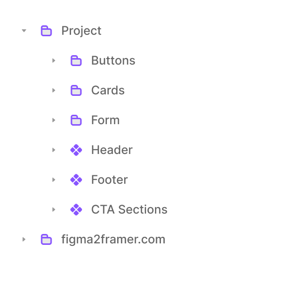
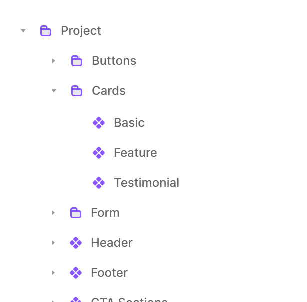
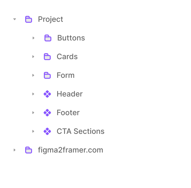
Components Included:
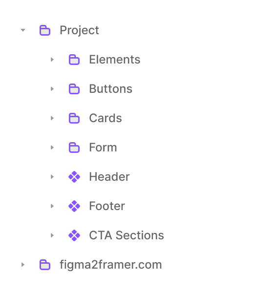
This Starter Template comes with all the core Components you need to start building right away:
Buttons: Primary and Secondary
Cards: Basic, Feature, and Testimonial
Form: All essential fields, styled and ready
Header and Footer
CTA Section
Copyright Code Component (auto-updates the year)
Each of these follows the same system — consistent Spacing, Responsive Layout, and clear Naming.
You can Reuse, Replace, or extend them however you like.
(Soon, you'll also be able to swap any Component directly from figma2framer.com — quick links will be added inside each Component note.)
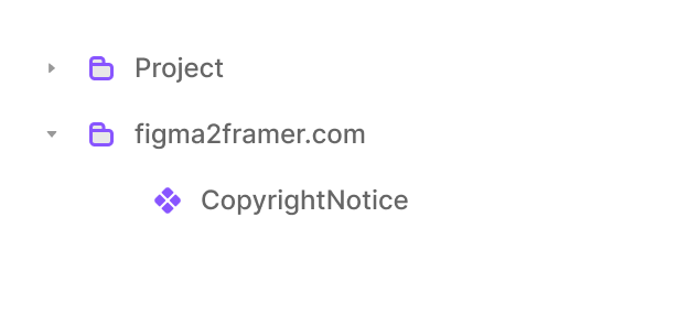
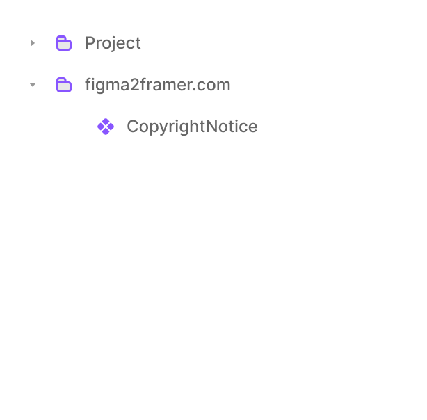
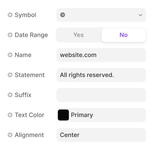
Code Component:
The Starter Template also includes a simple, useful Copyright Code Component — ready to drop into your footer.
It automatically updates the year, so you never have to touch it again.
You can customize the symbol, add a date range, include a link, or adjust alignment — all with easy properties.
Think of it as a small quality-of-life touch that keeps your site looking current, even a year from now.

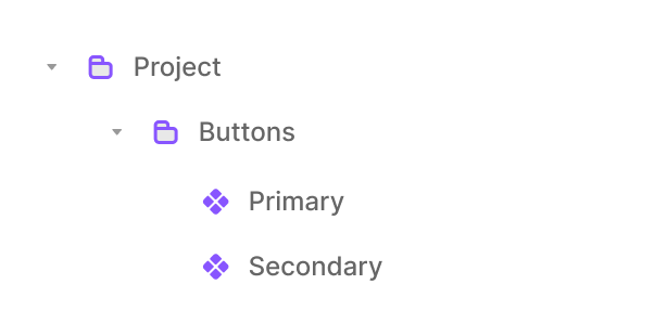
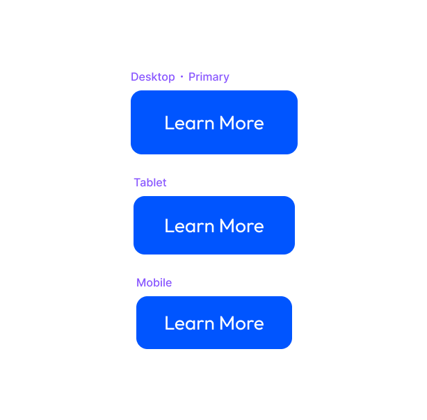
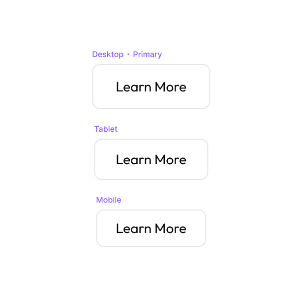
Buttons:
No more rebuilding Buttons from scratch.
You'll find a Primary Button for main actions and a Secondary one for supporting actions.
Both come with Hover states, consistent Padding, Responsive variants for Tablet and Mobile, and Accessible Contrast.
You can change the Text, Icon, or Color — the shape and spacing will hold up.
Drop them into your page, and they'll just work — no tweaks needed.
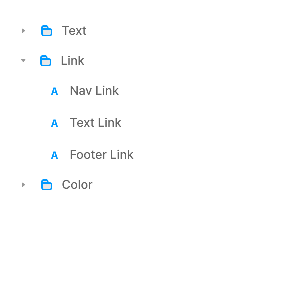
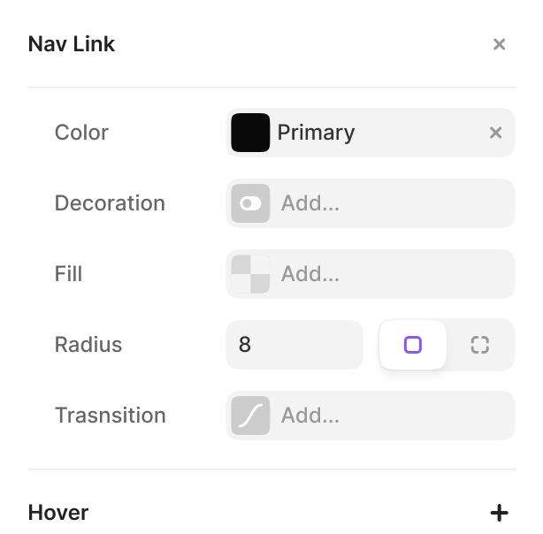
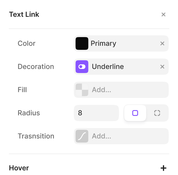
Links:
Text links can be tricky — they often look too small or too strong.
This Starter Template keeps them simple with 3 ready-to-use styles: Nav Link, Text Link, and Footer Link.
Each one already has Hover Colors and Underline behavior, so you don't have to style them from scratch.
Change your Primary Color once, and every Link updates across your project.
It's small details like this that keep your site looking consistent.
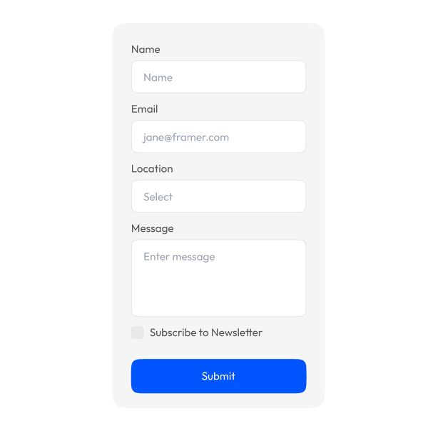
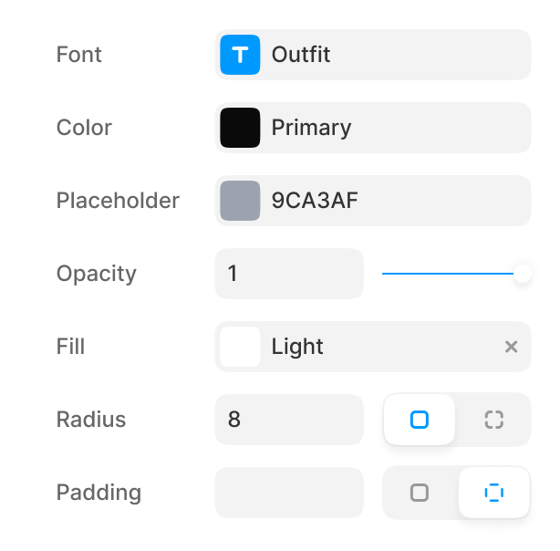
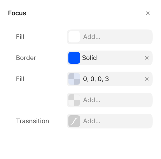
Form:
This is your plug-and-play Contact Form.
Name, Email, Location, Message — all styled, spaced, and ready to use.
Inputs already have proper Padding, Borders, Shadows, and Focus States.
You can connect it to your form delivery service, update Labels, or change the submit Button Color — everything else is done.
It's clean, accessible, and looks professional right out of the box.
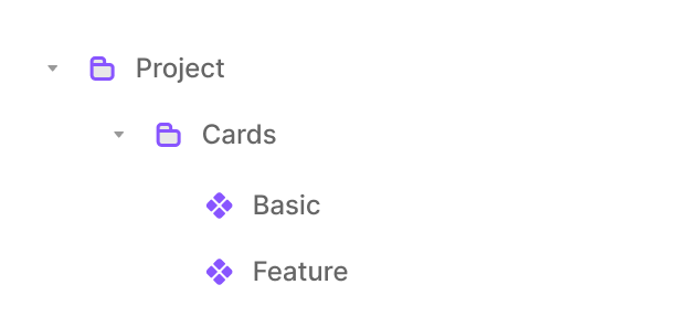
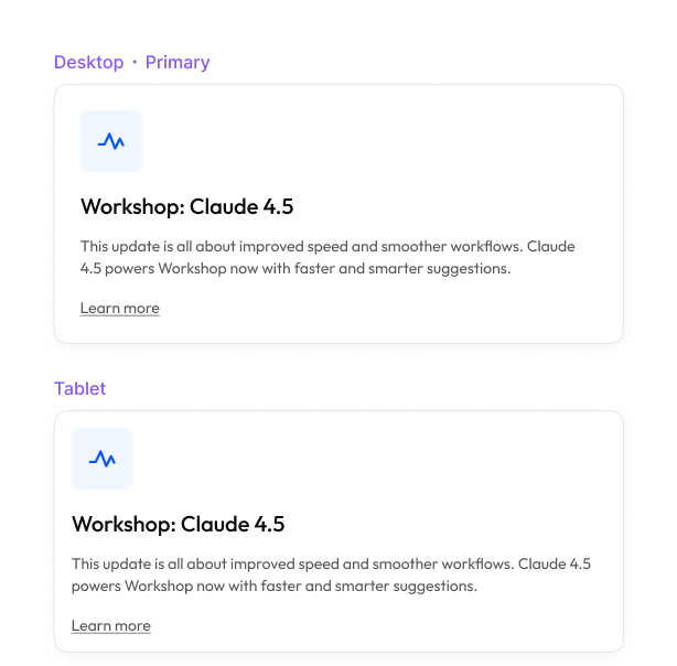
Cards:
Cards appear everywhere on a website — so this Starter Template includes three to get you started: Basic, Feature, and Testimonial.
Each one adapts perfectly across all Breakpoints.
You can swap Images, change Icons, or edit Text, and the Layout will stay balanced.
Use them for Features, Team members, or Testimonials — they're flexible enough for it all.
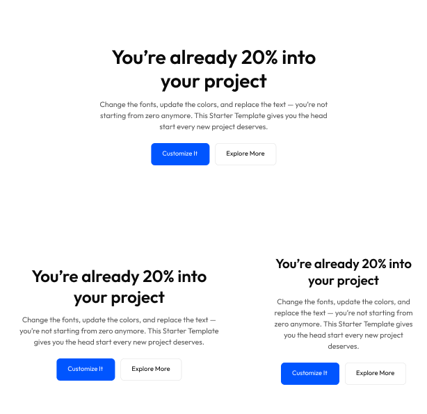
CTA (Call to Action):
This is your final section — the one that gets clicks and conversions.
The CTA comes ready for Desktop, Tablet, and Mobile, with a Heading, short Subtext, and two Action Buttons.
You can change the Text and Colors to match your tone — everything else, like Spacing, Alignment, and Responsiveness, is already handled.
Drop it at the bottom of any page, and you've got a clean, professional closer that just works.
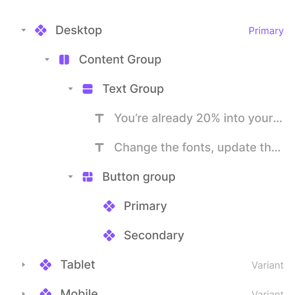
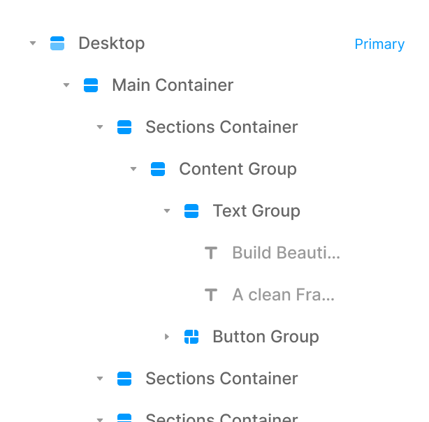
Naming:
Everything inside this Starter Template is named in plain, human language — no random Frame or Stack chaos.
Each Layer tells you exactly what it is:
Main Container → Section → Content Group → Text Group → Button Group.
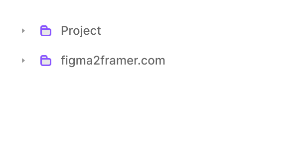
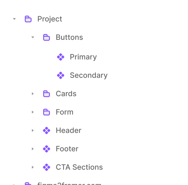
Assets:
All components live neatly under Project → Components — with folders for Buttons, Cards, Form, Header, and Footer.
Styles:
Text styles like Title Large or Body Small already scale across Desktop, Tablet, and Mobile. Colors are named by purpose — Primary, Secondary, Background — not by appearance.
So when you remix or explore, you'll instantly understand how everything fits together. You won't have to guess what connects to what — it's labeled the way you think.
Open the Layers panel and you'll see — everything just makes sense.

Remix & Customize:
Here's the fun part.
Remix the project, switch your Primary Color, update the Font — and just like that, it feels like your brand.
No complex setup or design theory required.
Explore each section, tweak it, and see how everything responds in real time.
You'll learn Framer faster simply by experimenting — no blank canvas, just progress from the start.