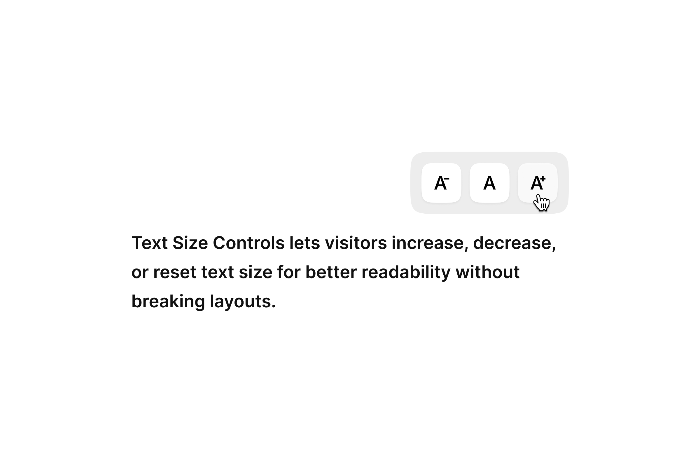
Text Size Controls for Framer
Text Size Controls lets visitors increase, decrease, or reset text size for better readability without breaking layouts.
Installs
Typography is one of the strongest parts of any Framer project, but it doesn't always land the same way for every reader. Some prefer slightly larger text, some prefer smaller, and some simply need a comfortable reading mode. Offering a simple way to adjust text size is one of the easiest, most meaningful steps toward better accessibility.
This component exists to make that step effortless for you and intuitive for your visitors.
Before you start
If you're reading this, you most likely already opened the remix or installed the code component into your project. This page gives you a clear walkthrough of how things work so you can integrate it smoothly with your own UI.
The Text Size Controls is intentionally minimal:
You decide how it looks, where it sits, and how it fits into your overall layout.
As you've probably noticed while previewing it, the logic stays behind the scenes while your UI stays fully yours.
How to use it in your Framer project
Step 1: Place the Code Component on the page
Drop TextSizeControls anywhere your controls will live, Header, Footer, a subtle section inside your layout, or even embedded in a utility strip.
You'll see a blank placeholder until you connect your own UI component.
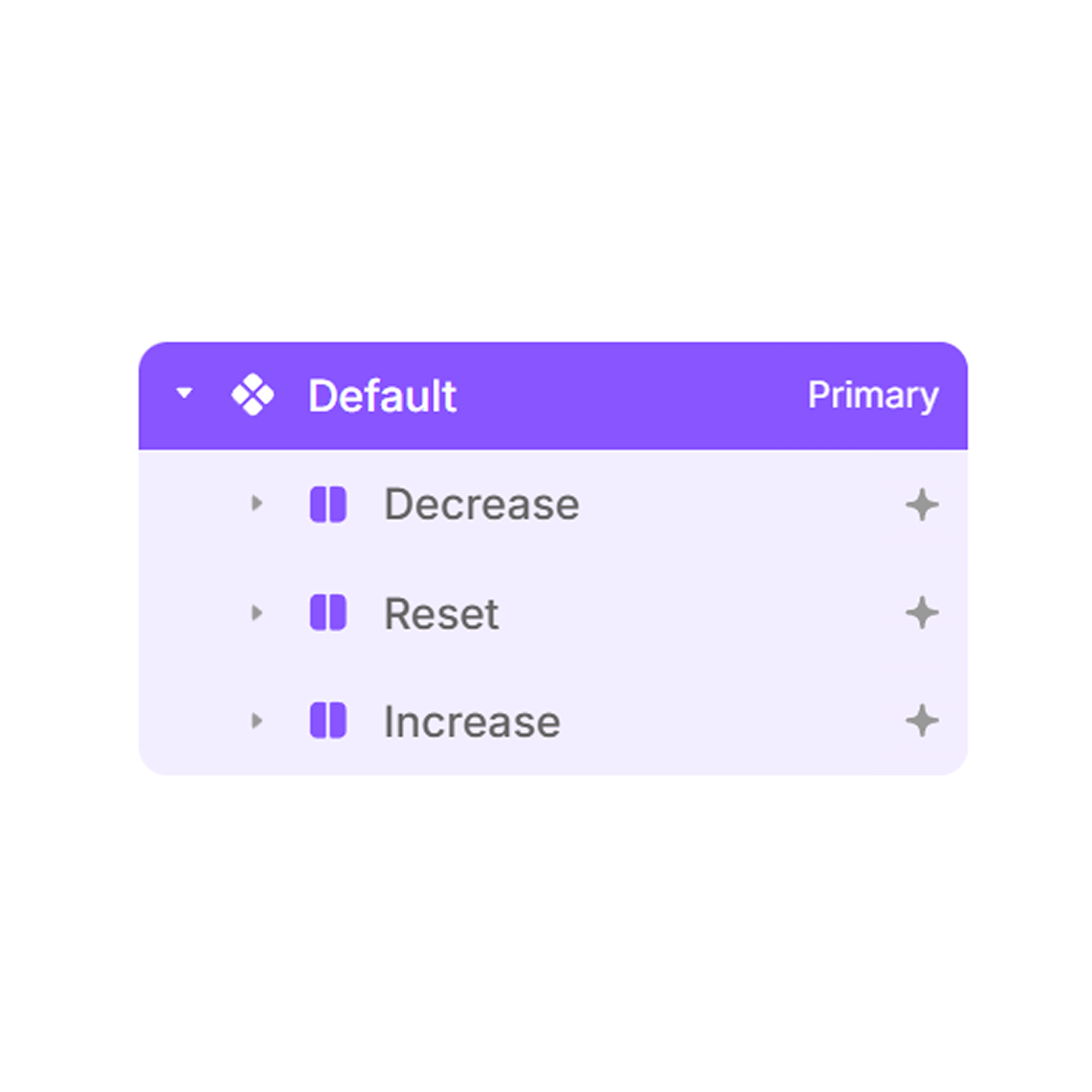
Step 2: Connect your own UI
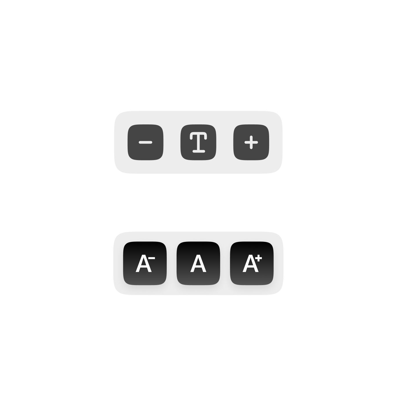
Most people use three simple elements:
A "decrease text" button
A "reset to default" button
An "increase text" button
Inside your UI component, make sure these layers are named clearly so the TextSizeControls knows what to respond to. If you've seen the inside of the component, you already know how it picks up interaction from click-target layers, nothing complicated on your end.
Just connect your UI to the Controls property and you'll see everything come to life instantly.
Screenshot: text size controls and their linked actions, helping users adjust reading size directly from the interface.
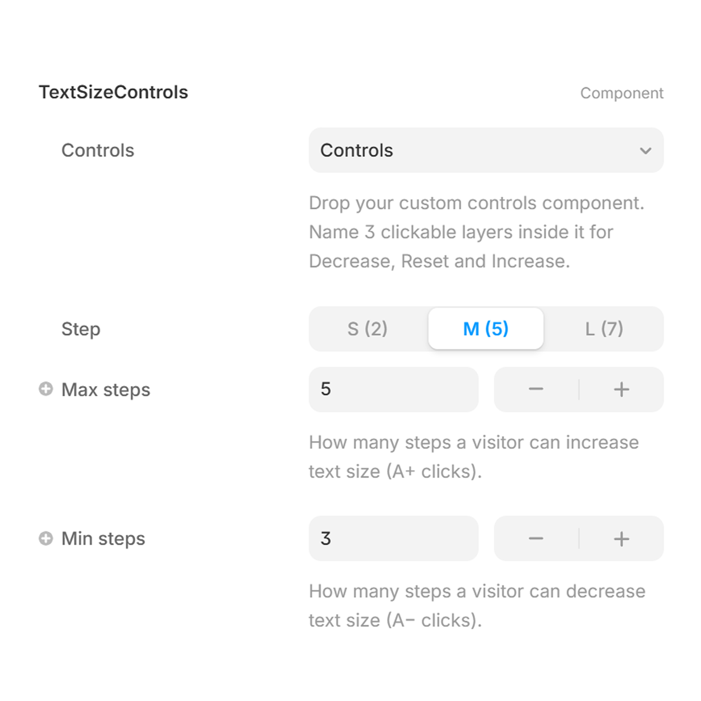
Step 3: Adjust the behavior
In the right panel, you can set:
How many steps up/down the text can scale
How strong each step should feel
Whether the visitor's preference should be remembered
Whether to show the pill-based step indicator
These settings don't affect your design, only how the scaling behaves behind it.
Screenshot: text size behavior is configured, including step size and limits, to support consistent readable scaling.
Step 4: Publish
Once everything is placed, publish your project and try resizing the text live. It works everywhere on your site automatically especially pages built with native Framer text styles.
Your visitors now have a simple, accessible way to make your content easier to read.
Where it fits naturally
You've probably already tried a few placements while testing. The most common areas designers use:
Header
A compact A− / A / A+ row in the top navigation is easy to notice without distracting from the layout.

Footer
A subtle choice that works well on long, content-heavy pages.

Utility Sections
Some designers place it near search bars, article tools, sidebars, or reading preference areas.
This component is flexible, so it blends with whatever visual system you already have in place.
Free UI Components you can copy/paste (optional)
Along with the TextSizeControls, you may have noticed a few pre-built Framer UI components included in the remix. These are purely visual, no logic inside meant for quick setups or as starting points to build your own version.
You can paste them directly into the Controls slot, or study how they're structured and create your own interpretation.
Nothing in your final design is tied to these, they're simply here to speed things up if you want them.


Get the Text Size Controls Code Component
Add simple, clear text resizing to your Framer project in minutes.
Accessibility
Accessibility doesn't need to be complicated.
Sometimes even a single option letting someone read a little easier creates a real improvement.
Text Size Controls is meant to be that small, quiet layer in your project:
simple to use, invisible in design, meaningful for the people who rely on it.
Thank you for adding it to your workflow and making your site a little more comfortable for everyone.
FAQs
Should I keep the component unlinked to receive updates?
You can use it either way. Keeping it linked lets you update with new versions easily. If you choose to unlink, you can still replace it later by dropping in a fresh linked version.
Will unlinking affect how the component works?
No, everything continues to function the same. Unlinking only removes the dependency on future updates, it doesn't break the logic already inside your file.
Is this built using native Framer methods?
Yes, no unnecessary scripts, no heavy frameworks, and minimal overhead for your published website.
Why does the UX feel simple compared to other text-size widgets?
Because that was the goal. The logic sits behind the scenes so the visual design stays fully yours. You can create any UI you want simple icons, a toolbar, or a custom control block while the Text Size Controls quietly manages accessibility behavior in the background. This keeps the component predictable for your visitors and flexible for your design system.